I led the design process to create a universal sign in/create an account flow to be used throughout all ParkWhiz digital experiences. This project had two important goals: 1. Gather user’s real phone numbers and 2. Create a flow that can be used throughout our products and platforms.
Key results
Role and timeline
Methods
Created reusable pages to be used across platforms
90% of users successfully sign in
Shortened the sign in process to a minimum of 2 steps
Product designer
6 months
Competitive research
User journey mapping
Iterative design
The challenge
I was tasked with helping contribute to one our company’s biggest goals of gathering user's phone numbers while balancing user needs with technical feasibility. The company's first solution was to capture phone numbers through our checkout flows. Only a small amount of users did, and most of them turned out to be fake. In order to properly verify phone numbers, I led the design process to create an authentication flow that would not only collect phone numbers but also create a fast and seamless sign in experience.
A walkthrough of the new sign in process.
DISCOVERY
Finding user requirements
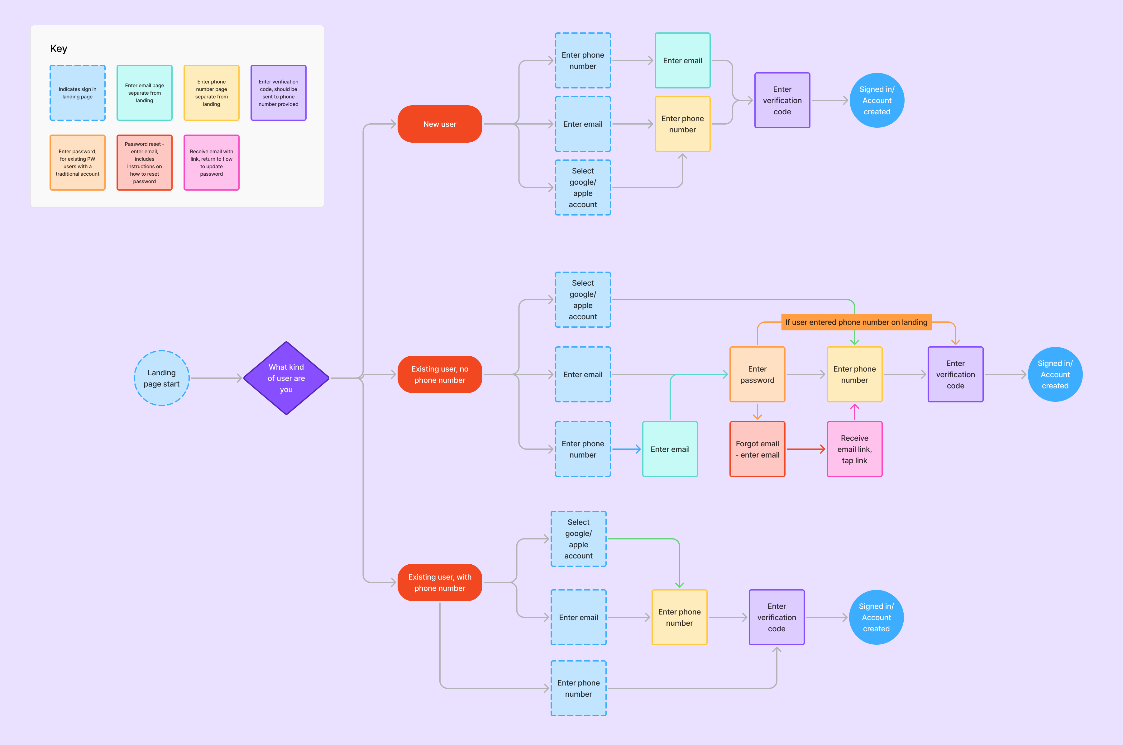
The difference in types of users would revolve around if we have a verified phone number associated with the information users provided. This project would contain 3 types of users: new users, existing users without a verified phone number and existing users with a verified phone number. I worked closely with the engineering team to ensure that we could create a way for each of these users to access their accounts. In addition to phone numbers, we would require users to enter their email as well to see if they had an existing ParkWhiz account.
User flow mapping
We needed a certain amount of information from each user type, but some required more than others in order to sign in or create an account. Creating user flows helped structure each user’s specific needs and map out every page the needed to be created. Each user type had specific information needed in a specific order. The user flow seen below also allowed me to visualize steps that could be used by different users. For example, a page asking for the user's email could be used across all three user types.
User flows for a new user, a returning user without verified phone and a returning user with a verified phone.
Engineering and Product collaboration
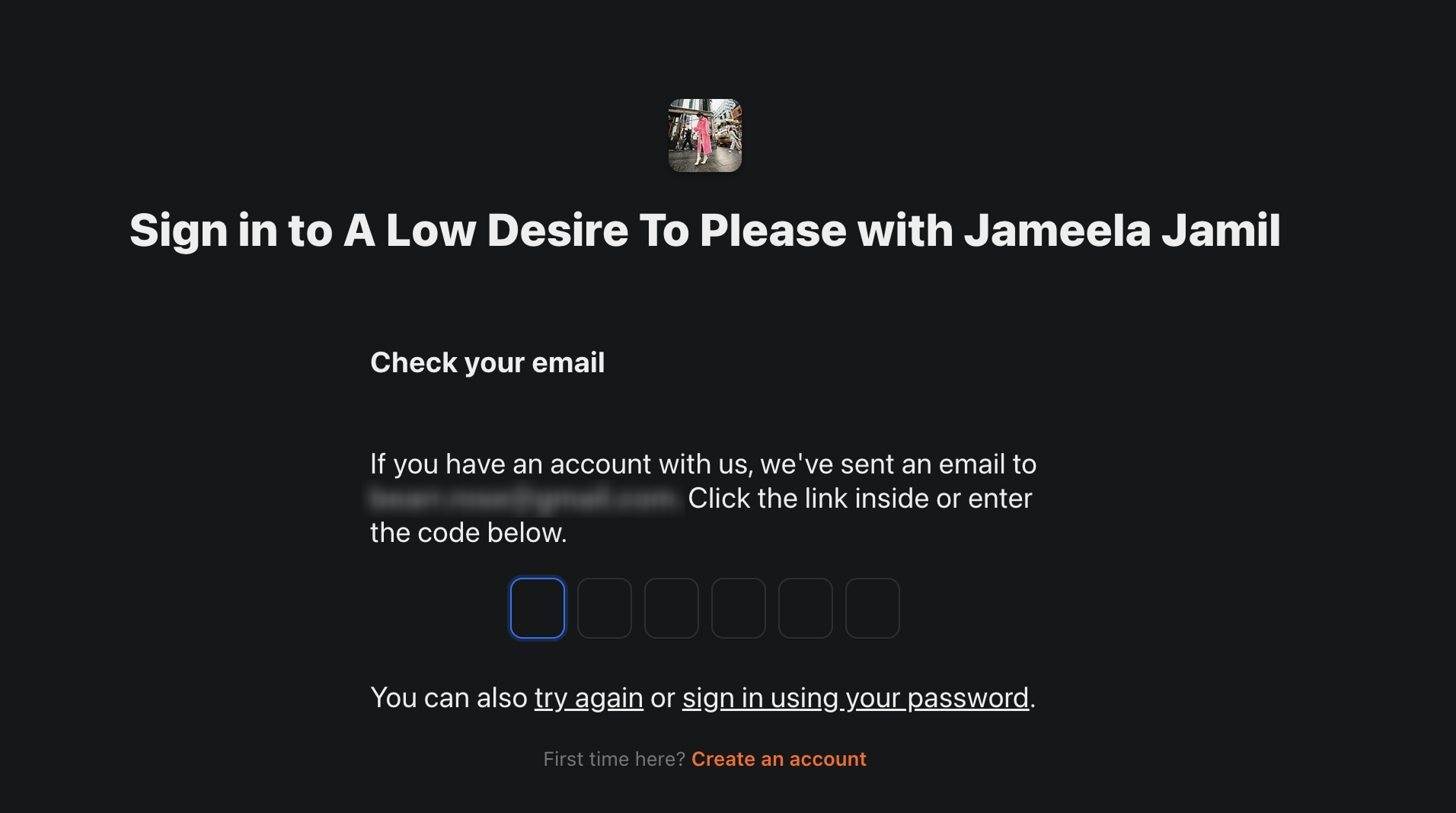
Throughout the discovery process, I kept close communication with the engineering team and the product manager in charge of the project. When I found a trend of competitor product's authorization flows were using email codes or "magic links" to avoid passwords, I approached stakeholders with the idea. The engineering team was an essential asset in figuring out how we can properly implement this process. It was through this communication I was able to pitch the idea of a magic link for easier sign in.
Substack sends users a code through the provided email where they then either click a link in the email or enter the code here.
EXPLORATION
Ideation
I took a simplistic approach to start off with; screens with small amounts of text followed by a single action. This a non-traditional sign in process (as opposed to entering a username and password), so it needed to be intuitive and quick. I regularly get feedback from my team members to see where I can make improvements. This results in many design iterations and conversations, but eventually leads to what we believe to be the best possible solution.
(From left to right) Early designs of the phone number entry, email entry and verification code entry pages.
FINAL DESIGNS
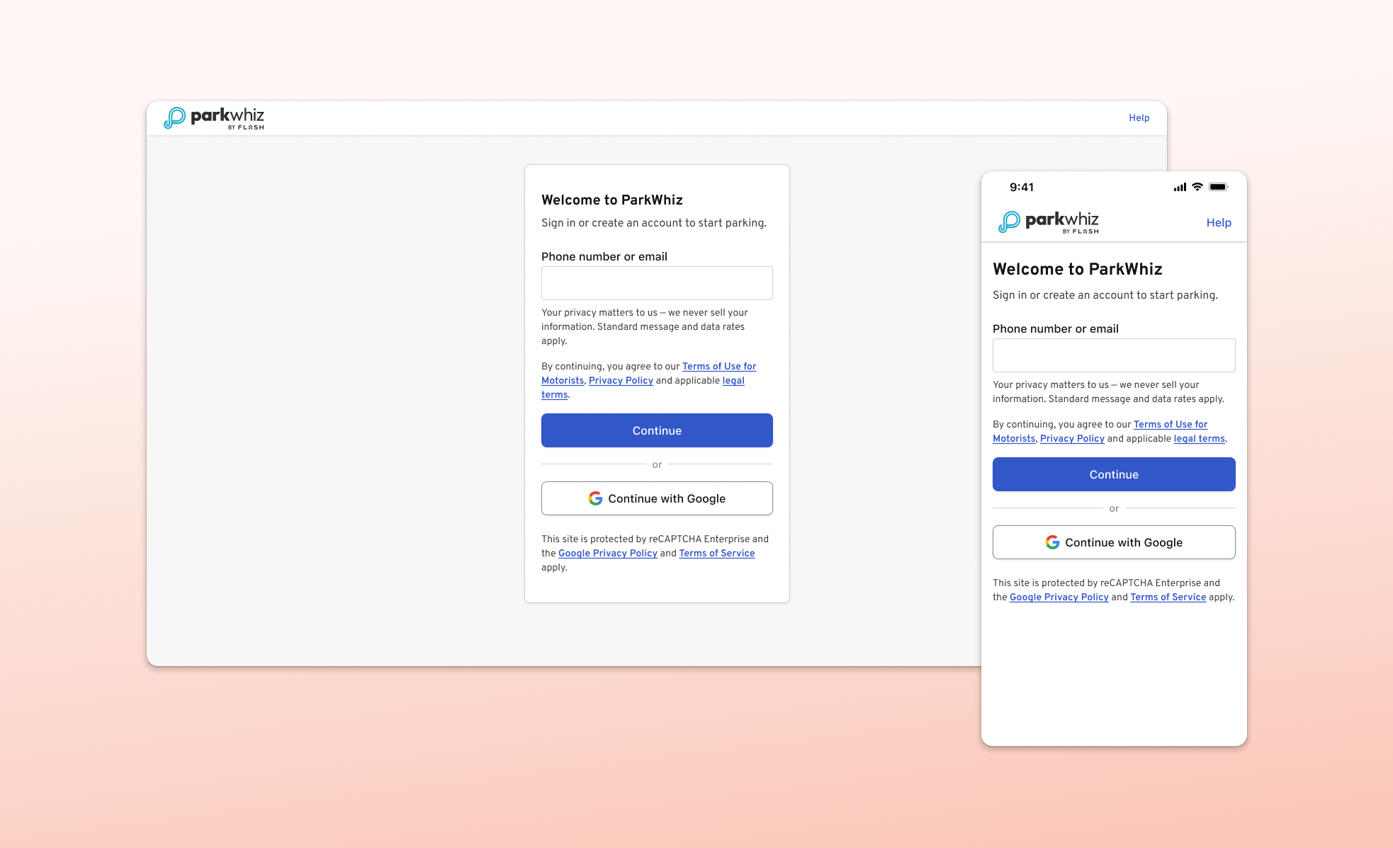
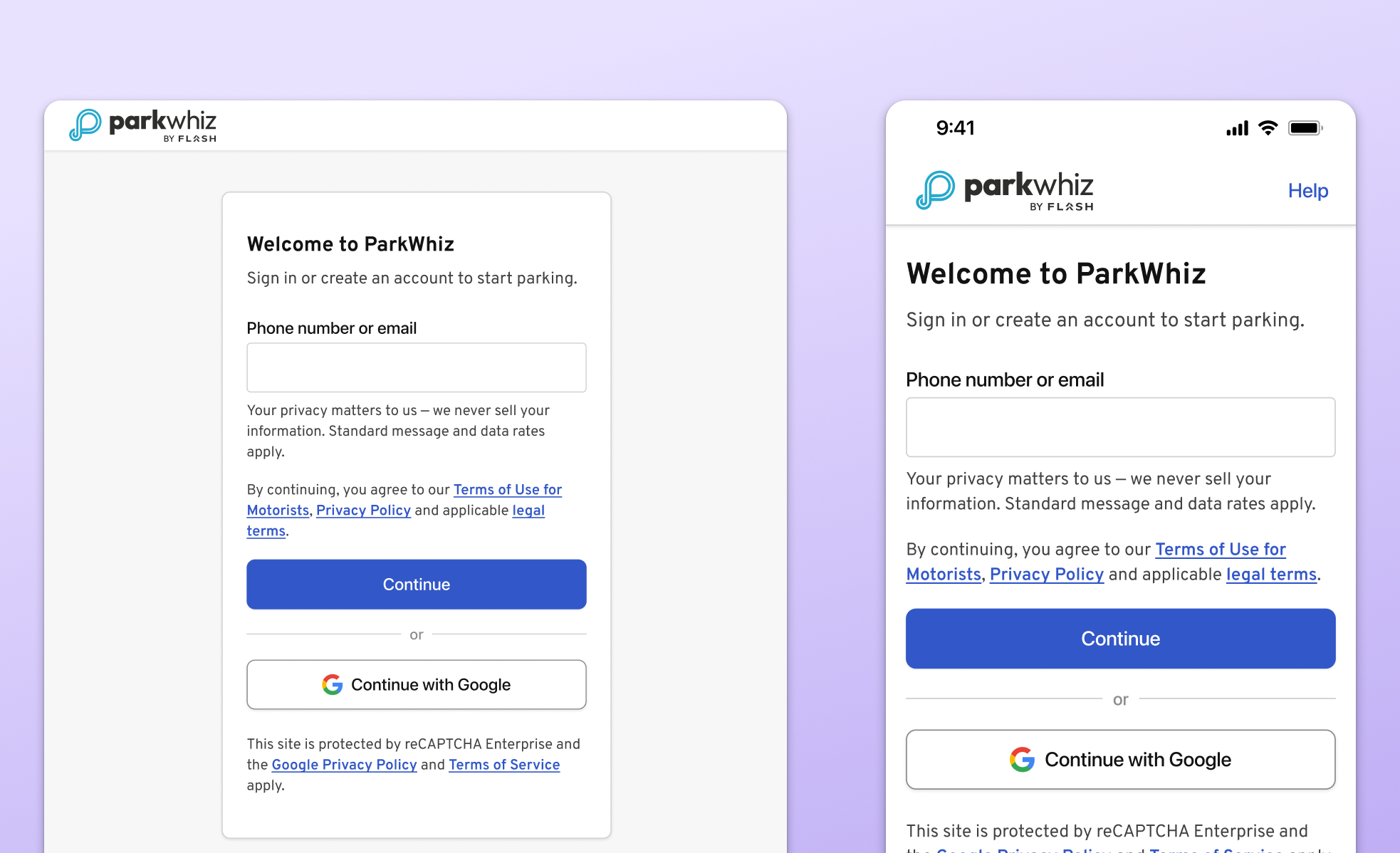
Landing page
Users are given the choice to enter either their phone number or email, whichever is most convenient for them.
Desktop and mobile view of the sign in/create account landing page.
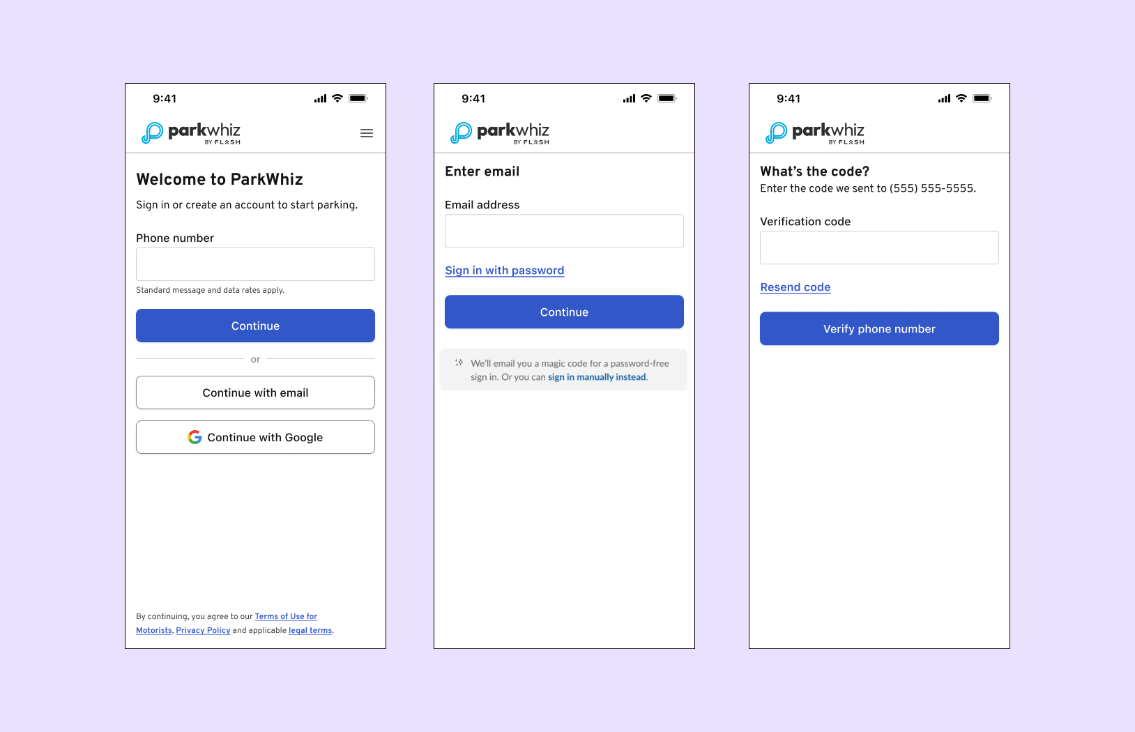
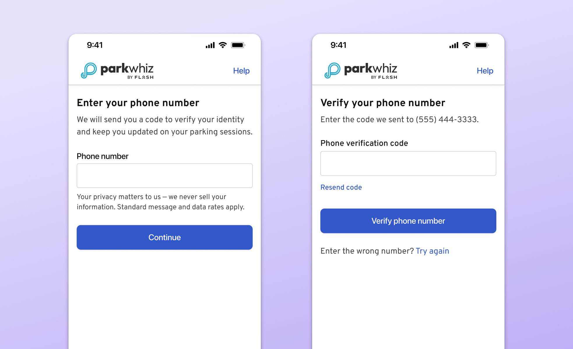
Phone number and verification
Phone number verification not only achieved a business goal of gathering user's correct phone number, but also allows users to sign in quickly and receive text notifications about parking sessions.
Phone number entry and phone verification pages.
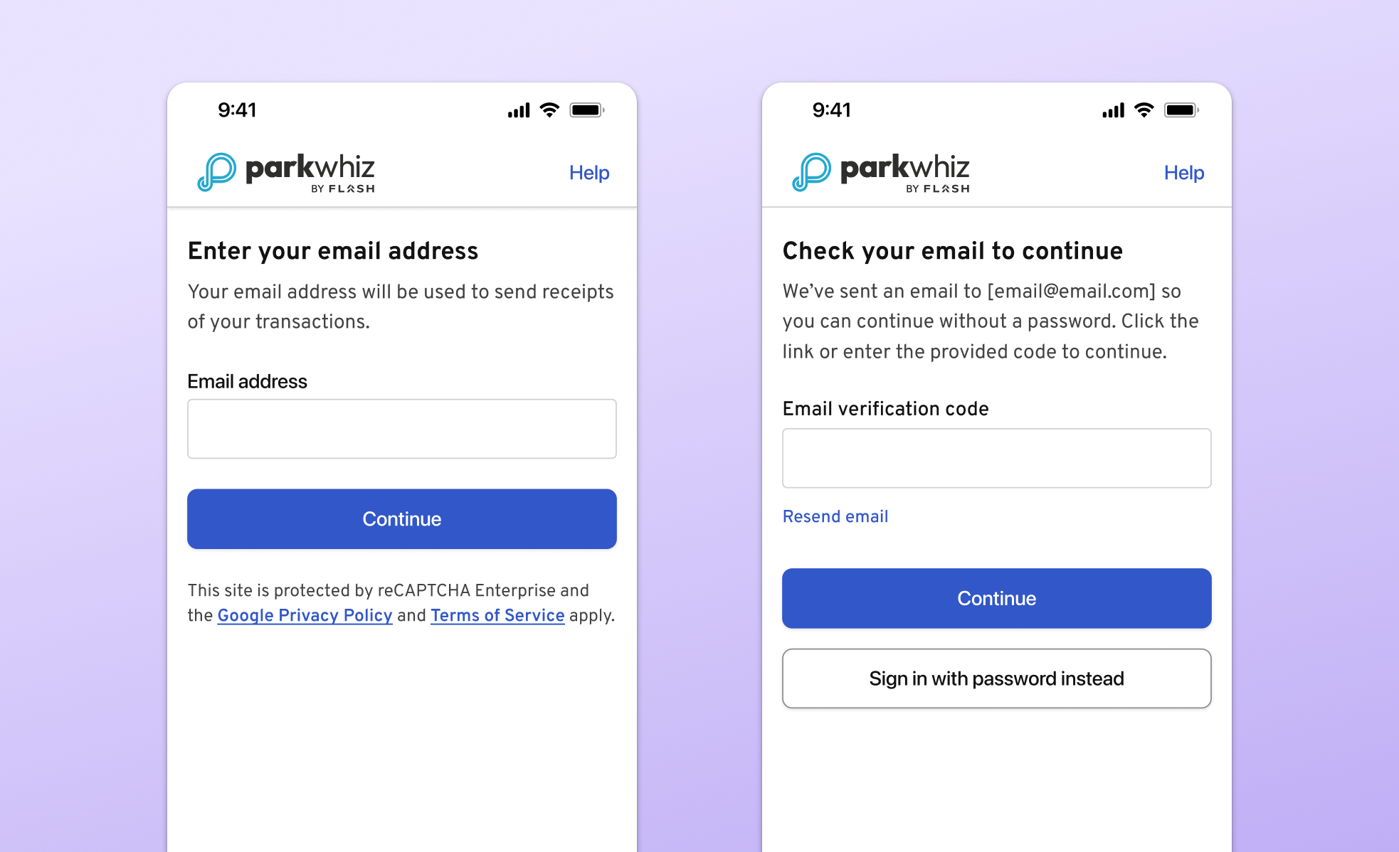
Email and email code
Users who enter their email are given two options on how they want to proceed. They receive an email with a code that they can use to continue or, tap a button in the email will automatically move them forward in the authentication process. They can also sign in with their password if they so choose.
Email address entry and email verification code screens
CONCLUSION
Platform rollout
Between web, iOS and Android, the different engineering teams worked at different paces but released within weeks of each other. Overall, 90.4% of users who see the new experience successfully sign in. New users and those with already verified phone numbers are getting through the process quickly and easily (~98% success, ~30 seconds end-to-end). Existing ParkWhiz users who do not have a verified phone have a longer process. Still, around ~95% are successful in ~60 seconds.
What I learned
Working on a very small design team (3 people) can prove difficult when it comes to proposing ideas because of the somewhat small influence we have over product decisions. Despite this, I learned that taking the time to construct a strong case for a new feature can pay off in the end, like it did for the email code feature. I sometimes get caught up in thinking about what we cannot do instead of thinking about all the possibilities and what would be best for the user. This project taught me to continue prioritizing the user and don't hold back any ideas.
Moving forward
While these initial results are great, I'm interested in ways in which we can improve the process. Maybe the flow is too long or has too many steps? Can we implement bio-authentication to speed things up? In the future, I would love to conduct some research to see what users find useful and what they find cumbersome.