The parking experience can be very frustrating due to overcomplication of what should seem like a simple task. When handled correctly, it should leave users wanting to return. I spearheaded a design refresh of our automated, license plate recognition (LPR) parking experience, allowing our company to connect multiple systems to create a single platform for our users.
Key results
Role and timeline
Methods
Created a cohesive digital parking payment experience
68% digital payment conversion rate
Product designer
5 months
Competitive research
User journey mapping
Iterative design
The challenge
Our competitors are making big steps forward in the LPR industry, but their technology may be lacking. Flash needs to prioritize the delivery of a hybrid parking system that ties together our operation system, Vision and Express Pay products. The future of parking is completely no-contact. The user should be able to enter a facility, park their vehicle, then leave with little to no effort. I led the research and design of our Express Pay product, allowing users to enter a ticketless payment system for future parking facility visits.
The complete Express Pay flow
DISCOVERY
Competitor analysis
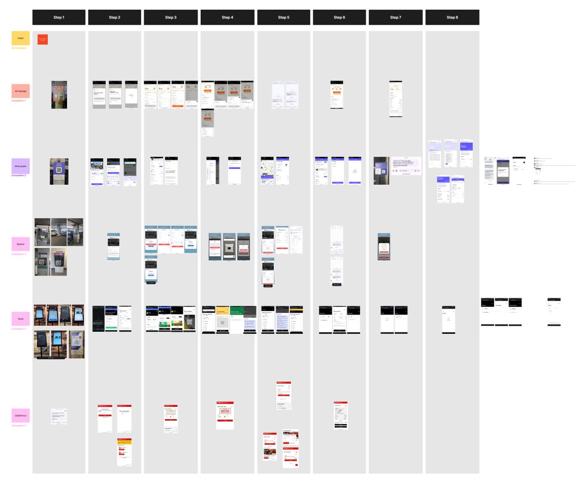
Our team went through several different LPR parking experiences to see how the most advanced technology currently operates. I then compiled photos and screenshots to map out those flows and compare similarities.
Walkthroughs of each competitor product using screenshots to compare each experience, step by step.
Based on how our competitors were tackling similar problems, I distilled the information into four key factors that would drive success:
Communication It is imperative to keep the user updated on their parking session. Since the web experience was used, text message was the primary form of communication
Sign up/verification Phone verification is a very common practice among mobile digital products involving payments. This gives the user a sense of safety and trust with the product.
Payment information Most products want the user to save a payment method early in the process, to ensure the user can leave the facility easily and without friction.
Speed The better products had a fast sign up flow, clear instructions, and all the user had to do was leave the facility.
User journeys
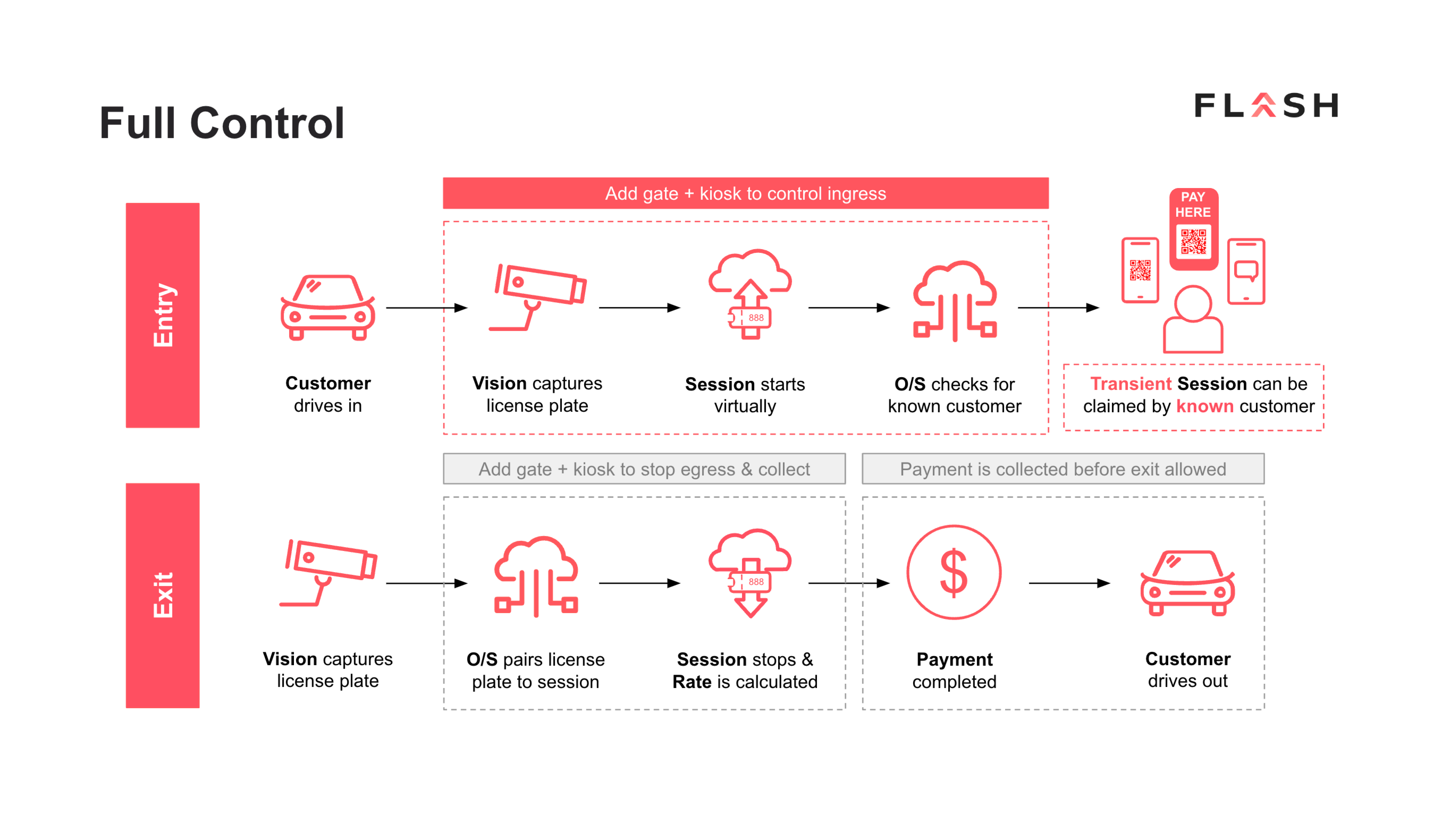
The product manager provided a variety of user journeys explaining the three types of parking facility settings to be enabled by our technology: full control, hybrid, and free flow. Technical and business restrictions prohibited us from diverting too much from these flows and our primary focus would be on full control.
Full control has entry and exit gates down, allowing for strict surveillance of facility traffic.
Research Insights
Competitive research allowed me to get a better idea of common practices, but also see inefficiencies in other products. This was not only beneficial to my understanding of the Express Pay product, but also helped to create the best possible experience that stands out from our competitors.
Key findings
Sign in/sign up should be quick and easy; we do no want to overburden customers
Communicate with the user through text so they alwasy have access to their session on their mobile device
Do not clutter the experience with too much information
Design decisions
Clean up the sign up flow to reduce friction for the user
Enable users to use Express Pay on future visits
Create a consistent visual style so users are aware of what product they are using
EXPLORATION
MVP
For the scope of this project, our strategy team and I decided to focus on how users enter the Express Pay flow and ensure they can leave the facility without the need of payment kiosks.
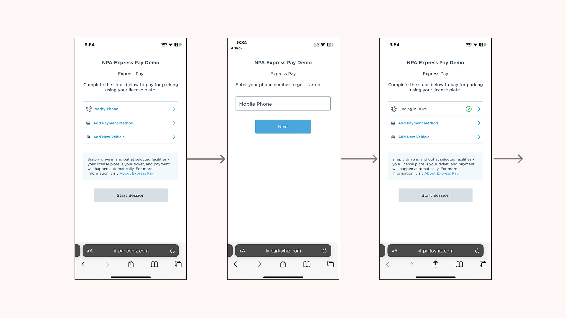
Prior to this project, the Express pay flow required users to "ping pong" between screens to enter the required information. For example, after the landing page, users need to enter their phone number. After they enter their phone, they are taken back to the landing page where they need to select another element and go to another page.
The original flow included uncessary steps to complete payment.
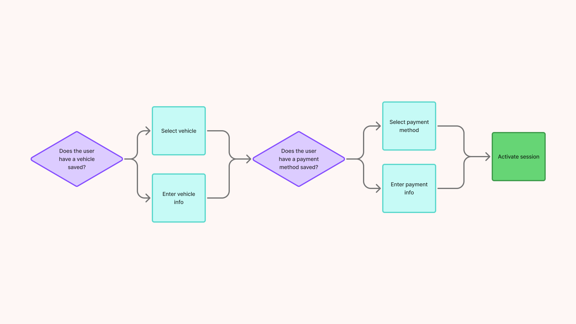
To decrease the amount of time spent in this flow, I created guided steps to remove the need to go back and forth between pages. Users would only have to see each page once, thus improving the speed of this process.
The new user flow no longer requires users to revisit pages.
Iterating and exploring
Once I figured out the user flows and requirements, I could spend time creating designs to meet these needs. This part of the design process requires much attention and communication with stakeholders and fellow designers. If new ideas for features that I think would benefit the user come up in this phase, I would need to see if the additional work would fit in the scope.
A brief example of the various design iterations to properly explore viable options
FINAL DESIGNS
Before and after
Our product goals were met and we were on track to hit deadlines. This new experience gives users ultimate flexibility in facility parking and lays the groundwork for future iterations.
Before
Too many steps
Required to go back and forth between pages to enter information
Inconsistent UI elements
After
Faster activation process
Clear and concise instructions
Consistent UI elements, headers and text styles
Brand acknowledgement to build user trust
CONCLUSION
What I learned
This was one of the bigger projects I got to work on at Flash. There were a lot of people involved, but it ended up being a valuable learning experience. My main takeaway is to consistently communicate with stakeholders. Since there were multiple teams working on this and it was a big priority for the company, I needed to make sure everyone was informed of my design decisions.
Testing
In a perfect world, I would have loved to do more user testing on our new flows, but due to our limited resources and team members, it unfortunately was not possible. I think testing is a crucial part of the design process and ultimately saves time, and I plan to advocate for more testing with future Express Pay iterations.
Moving forward
Since it's implementation, these designs helped Express Pay reach a 68% digital payment conversion rate at our first location. While this is a huge success, the data is showing the largest drop off point is when the user must enter a payment method. This infers that users are having trouble or do not trust entering their payment information. In the future, I can focus on iterating the payment method page to alleviate this issue.